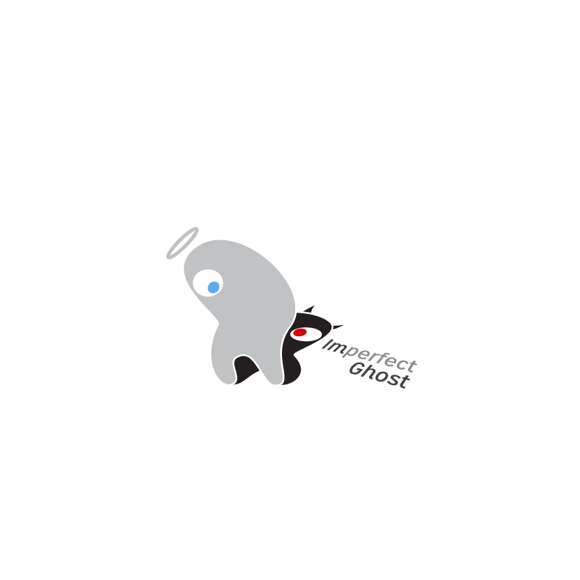
Imperfect Ghost
Gigafrost | Sun, 10/20/2013 - 18:26
Brief from client
Logo for a potential game production company. Something using ghosts and good and evil. Representing on not only our good games but also our clever and sometimes crafty ways in terms of creating games.
Wingless variant with a revised type treatment.
4 Comments
Variants of playing with opacity and using elements from the previous revision.
I love the middle. The slightly opaque top layer plays even more on the 'ghost' title. Both middle variations are nice. The halo and wings versus the horned guy in the background. I'd go with either of those.
I remember this one from a while back! I like the new variations as far as the font goes the one you have on top works for me. The one on tope is clean and simple!
i like! veeeery niiiice.
-borat