MrMorph
Brief from client
Mr Morph is a place where people can take part in the design and printing process of products. From homeware to fashion accessories, we currently offer a range of 10 carefully selected designer's products that can be transformed by you and adapted to your requirements through a very simple computer tool that you can use for free. Just come in, sit down and start browsing through our catalogue. Then, pick a product that you like and start changing the shape, the texture and the colour. Once you’re happy with the results, see it come to life in our 3D print Lab. This is a continuation from People's Atelier: http://www.brandsoftheworld.com/critique/peoples-atelier-ltd-3
We changed the name to make it more friendly and less politicaly charged. In context: http://mr-morph.com
Key Words:
-Modern
-Friendly
-Simple
-Affordable
-Democratic
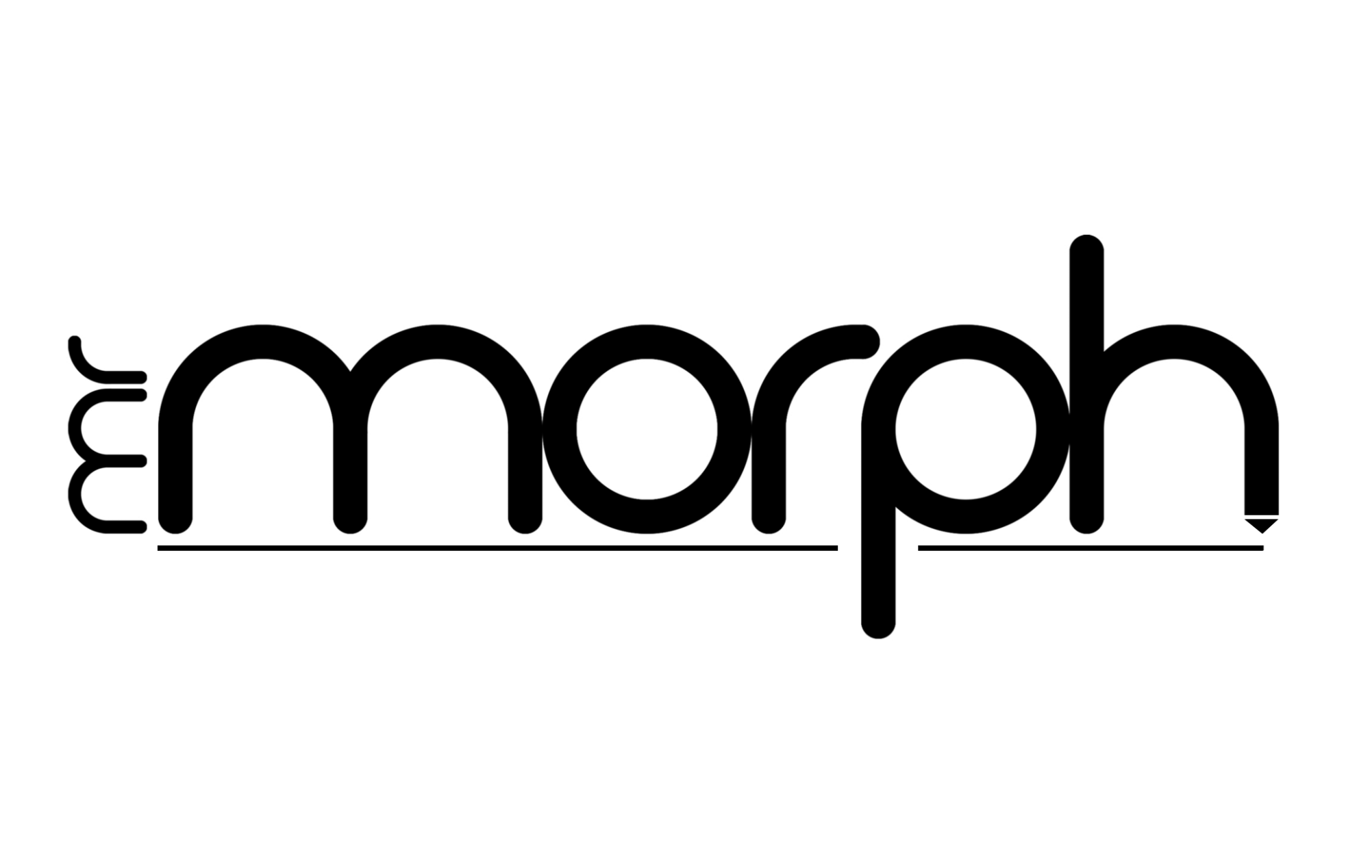
This version includes the idea of 3D printer (the extruder head on the H).
5 Comments
Give a bigger space from the arrow and the h
the line is not necessary but i like it!
and i like the spacing on this version better!
I like the line but i guess is a little without personality , no particular signs, somehow empty....i find the font pretty hard to read without some "juice", like an icon or something..
It's all right... but, you might add an icon or sth.
I never knew how an extruder printer's head looks like - now at last, I know..... or do I? (sorry, that was sarcastic, I know, but nobody will recognise a little downward arrow as being an extruder printer's nozzle.) the first version was better.
Hi Theo Brocklman, thank you for the feedback. I thought it would be better if the nozzle is just suggestive, not too explicit. Do you think it is not necessary?