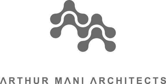
Arthur Mani ltd.
Brief from client
Arthur Mani Architects (AMA or Arthur Mani ltd.) is a young Architectural practice based in London and Paris. AMA's Architecture is "network-driven" meaning it is collaborative and linked to environmental, structural and cultural constraints. AMA's design process is fully focused on the client's desires and is driven by computational design tools as well as a multi-disciplinary approach to Architecture. Our aim is to create spaces that are playful, sensitive and unexpected.
AMA's logo should give a sense of the practice's networked, collaborative, playful and computational approach to Architecture. Inspiration could come from tube maps, Alexander Calder's mobiles, road networks, trees, leaves, corals, clouds, bird swarms. It should be as striking, simple and elegant as Louis Vuitton and Yves Saint-Laurent. It could be colourful if done subtilely (possibly through gradients).

After the nice advice from Alpreacher and since everyone said the last logo looked too much like a circuit board I made another attempt. It looks quite playful and simple, almost like a construction game for kids. I like this reference. In context: http://arthurmani.com


18 Comments
This is so much better than your previous versions. I'm not sure about the type or placement thereof, but in context I have to admit it looks pretty slick. Good job.
Thanks a lot thecuraga, hard work! Do you have any advice for a good type, this is quite a struggle, I have been trying many fonts.
The type isn't really bad exactly, I'm just not sure if I like how the bar in the "A"s are cut out, any clean sans serif would work well, the font you have now looks similar to avant garde or Gotham, just with the slightly strange "A". I can also see the relation of the "A"s to the symbol itself, so I guess that might work alright. I would only worry about the type if it really bothers you, I wouldn't really call it a deal breaker.
Excellent logo, and these versions it´s look better than them, maybe pull up the "ARTHUR MANI ARCHITECTS" at the symbol, and use a blue color
Thanks hp_digitalstudio, blue could be nice, like this? Right click view for real dimensions.
Much much much better. Congratulations!!!
Wow. In the context it looks great. Maybe you have to ask someone who is better in kerning than me. But, hey, don't listen to me. I am too much a perfectionist. Good job. Like they say "the best is the enemy of the good". Sometime we just have to stop and rest from our works.
i like it, as it is. Typography is a bit to strong for the symbol, there is a contrast between the rounded symbol and the sharp corners in the font, but i guess that's just me talking. very good job and keep it that way, or better....
i like it, as it is. Typography is a bit to strong for the symbol, there is a contrast between the rounded symbol and the sharp corners in the font, but i guess that's just me talking. very good job and keep it that way, or better....
FANTASTIC.
I do agree with Hueroth however.
Very nice concept, it fits perfect with the name, and also fits the context
inspired?
Lol I did not know this logo but thanks a lot for posting it. They added a perspective to it though :) Is it really that close?
LMFAO INSPIRED!!!
Shoot i cant belive i didnt see the SONY walkman logo!!
ICONIC!!
VERSION 8 THEN!
THANK YOU FOR POSTING THIS! When I saw the latest version, this IMMEDIATELY came to mind, but I couldn't for the life of me figure out what company it belonged to. I'm pretty sure I just wasted about 15 minutes searching for it on Google.
Now I also recognize the walkman logo from my old sony ericsson... Maybe you can straigthen the symbol a bit
I love this.
It is far enough for the walkman logo... i think.
The blue one!!!!